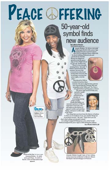
DESIGN
WEB DESIGN
Click or scroll down to see examples of web design.
Click images to see live versions of the sites.
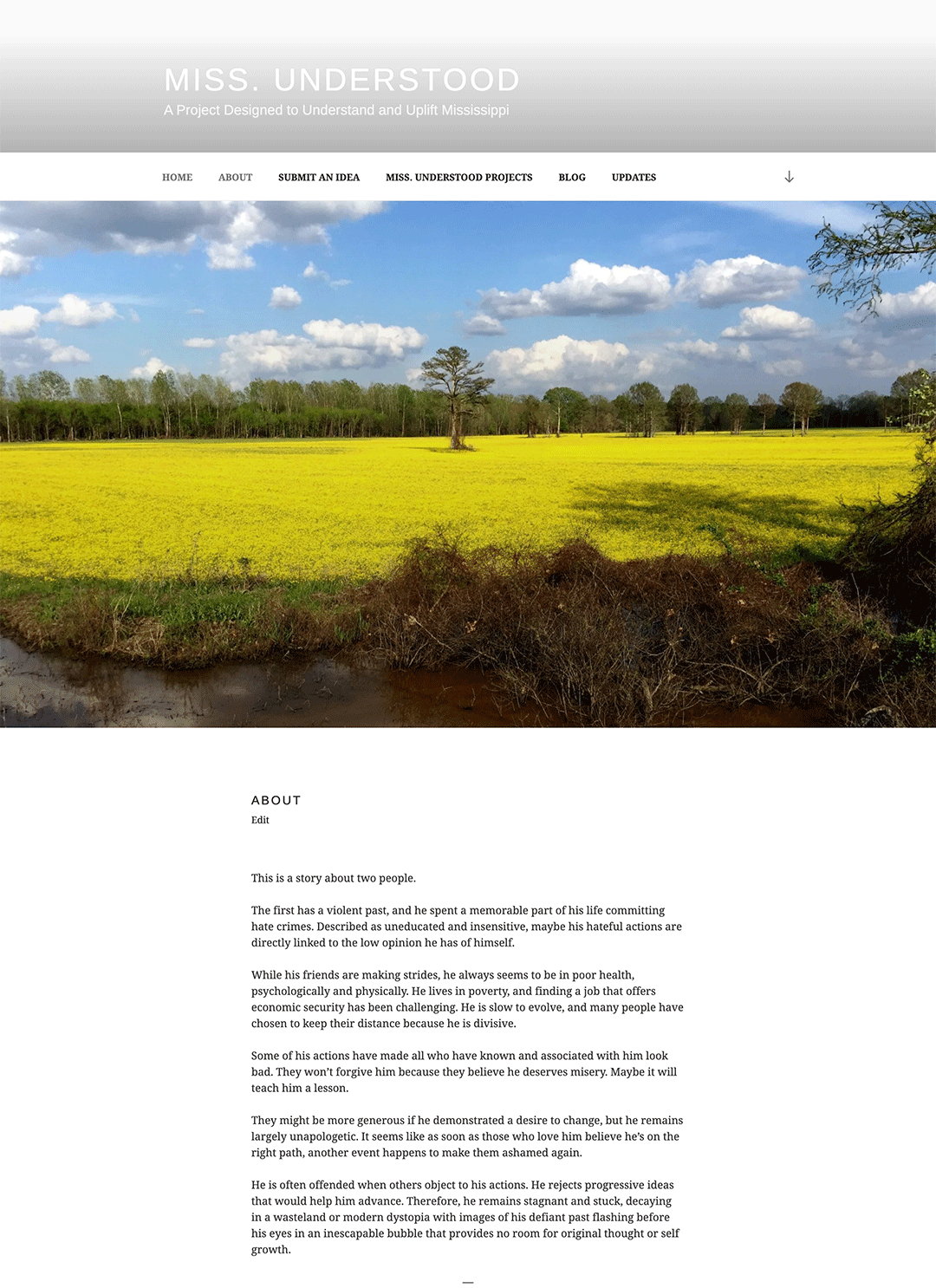 |
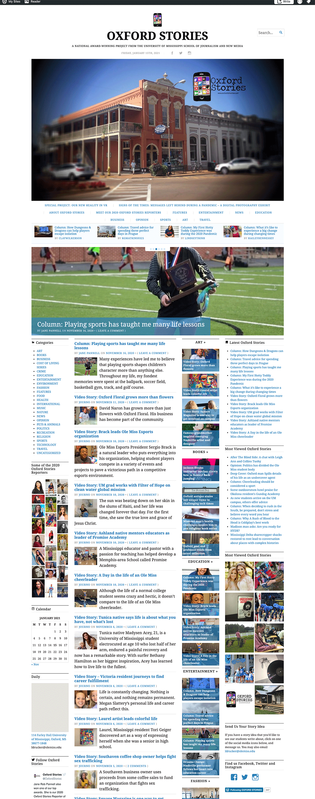
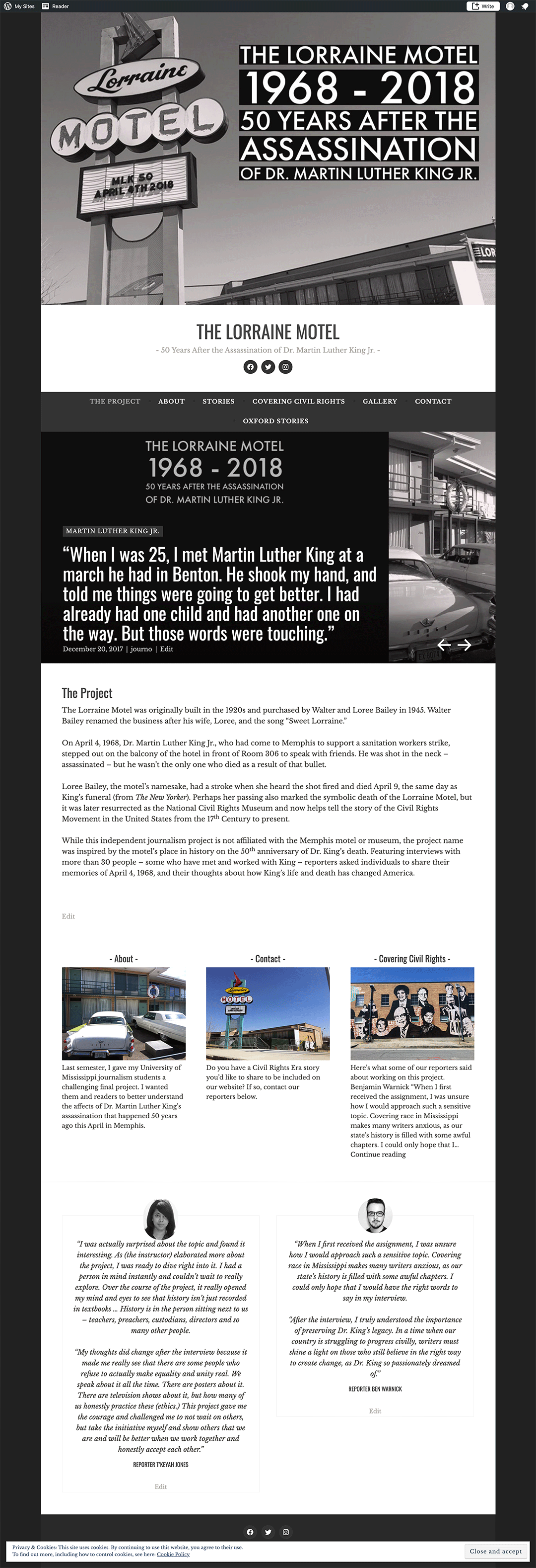
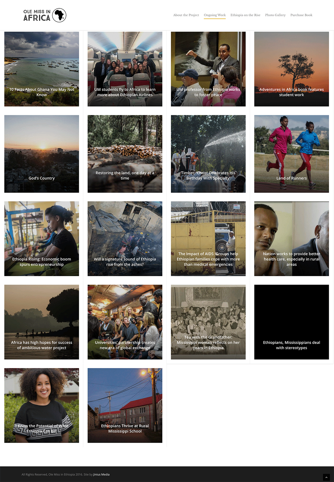
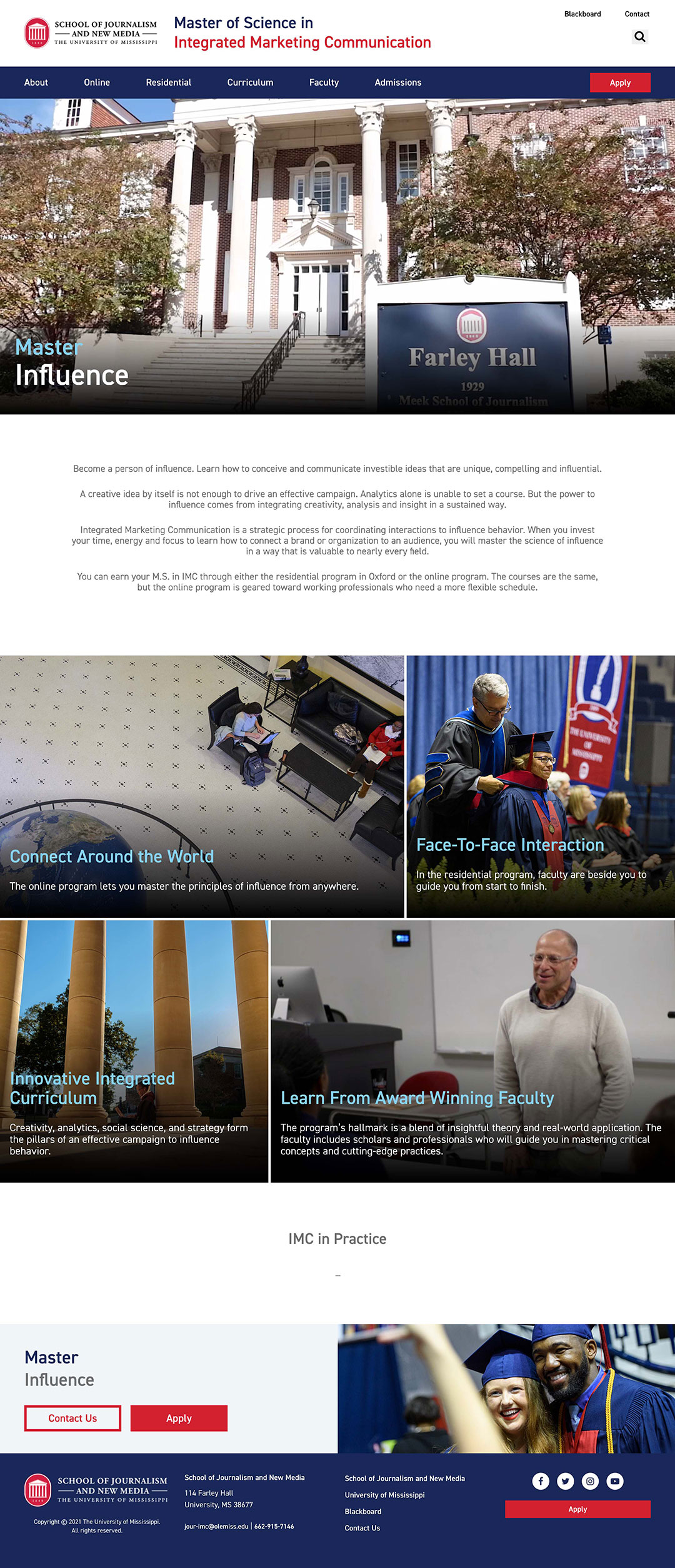
This is a project website I created and customized using WordPress. It also showcases student work. |
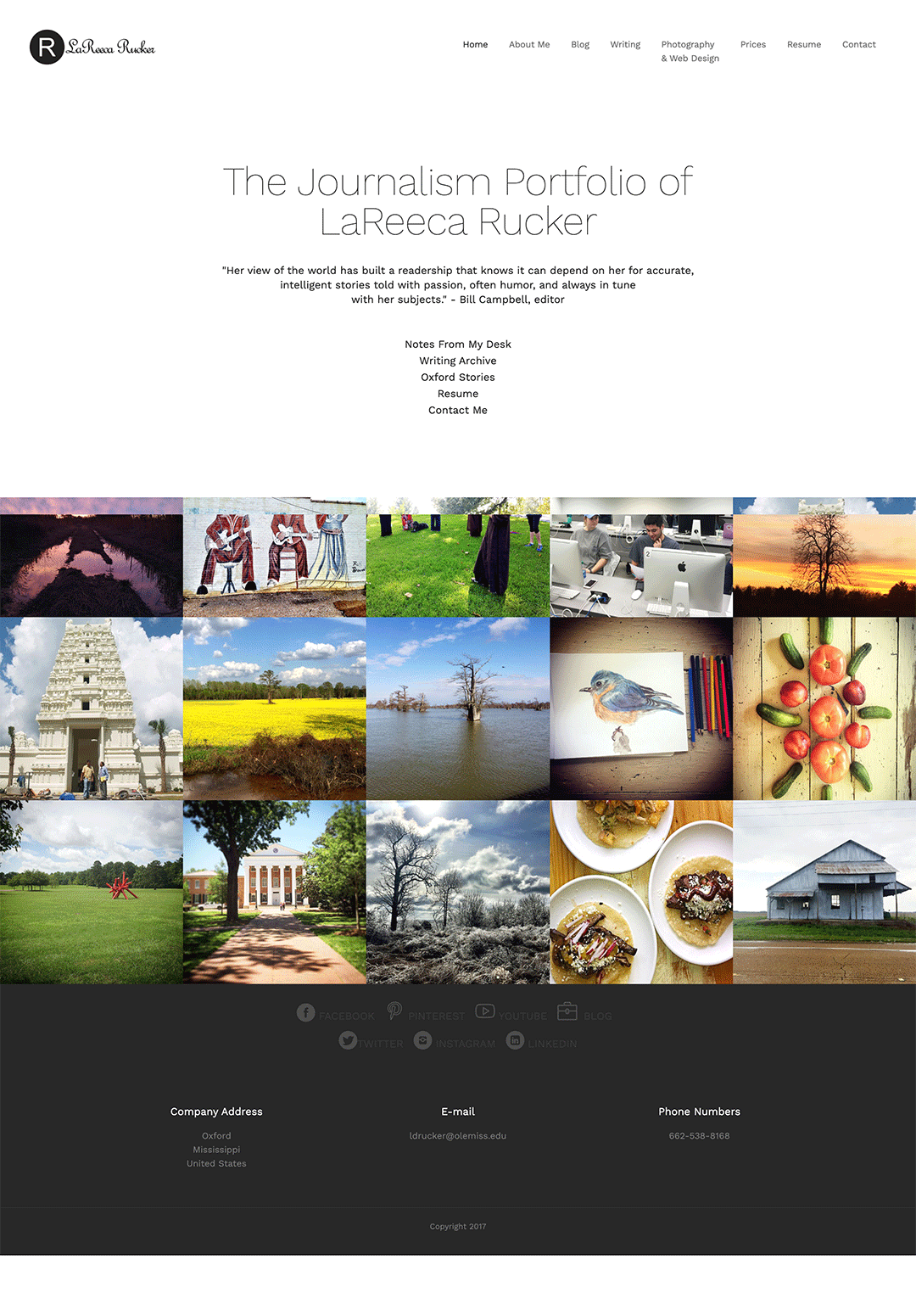 |
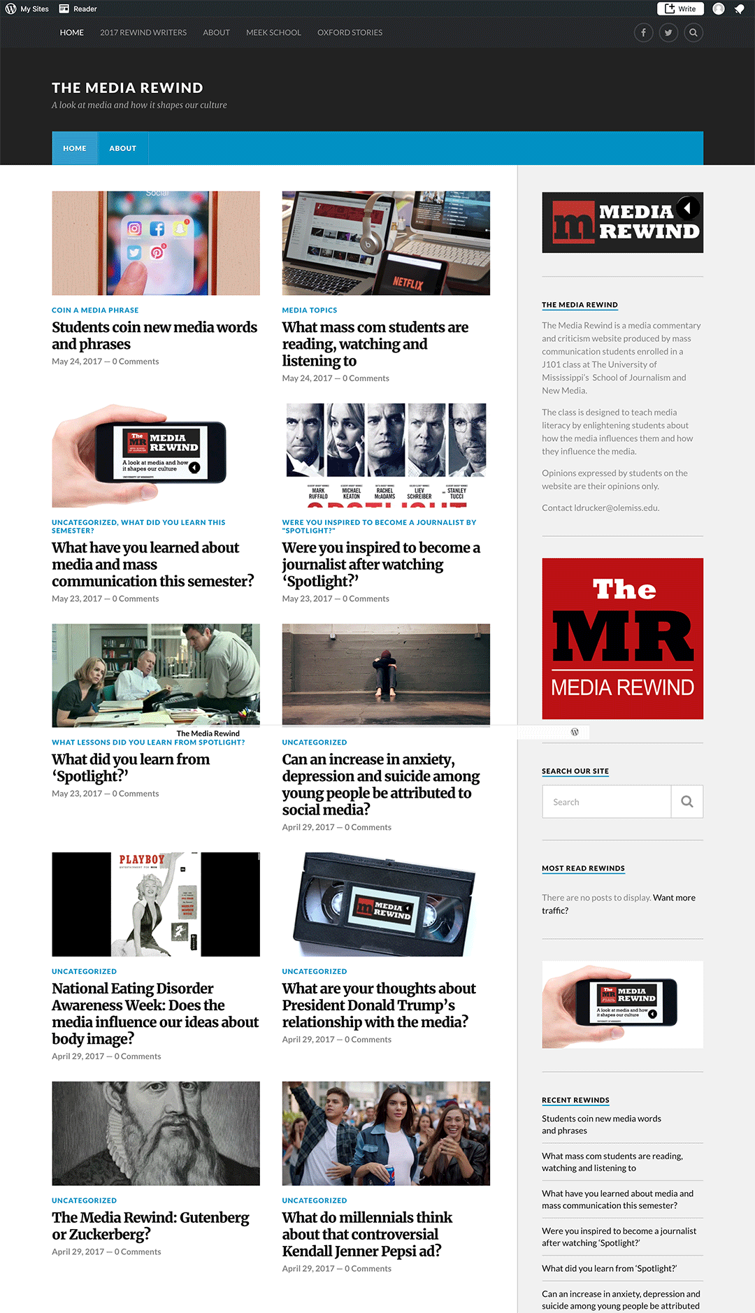
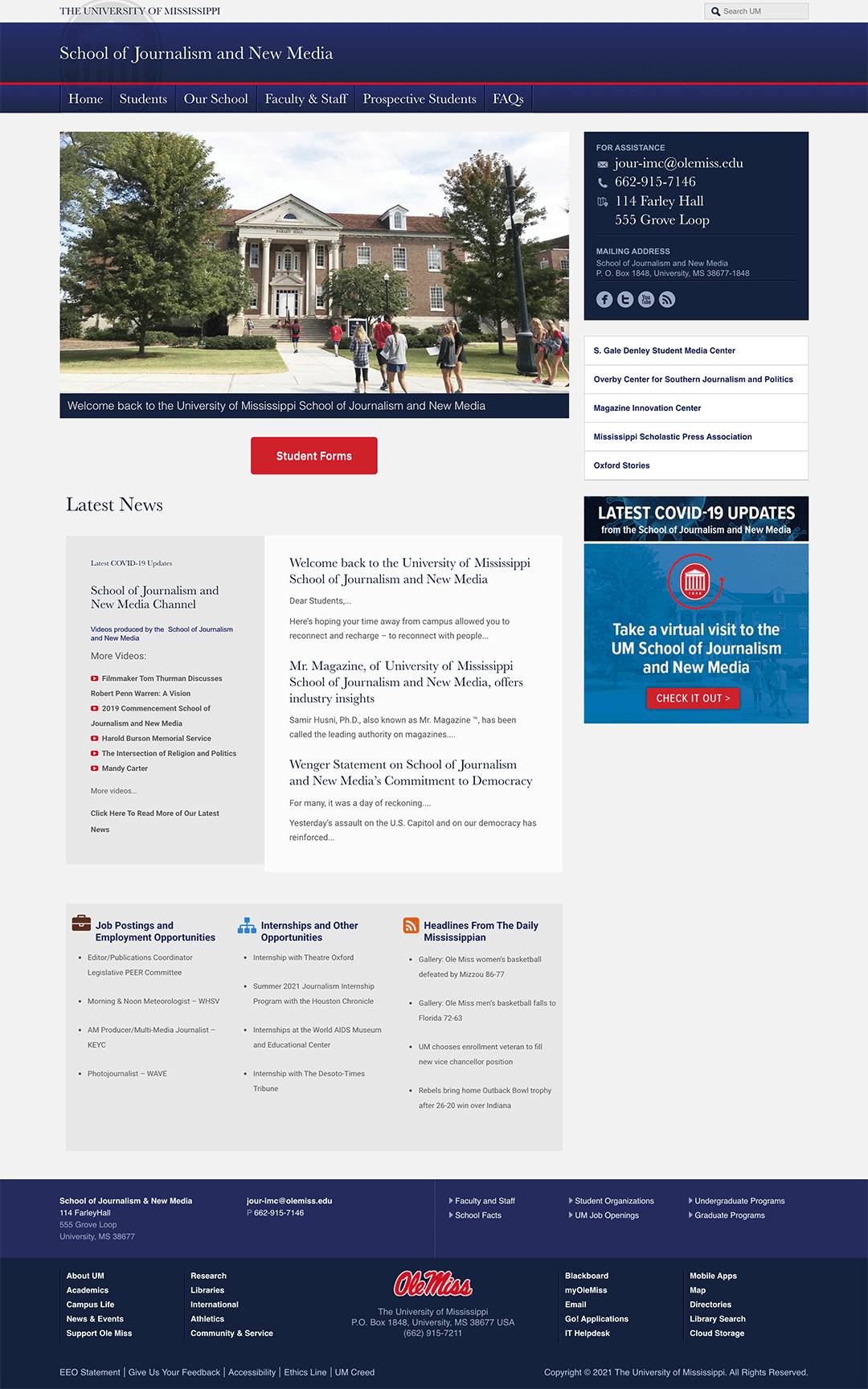
This is the website you are currently viewing. I created it using Dreamweaver by amending a template and the HTML and CSS code. The photos featured were taken by me.
|
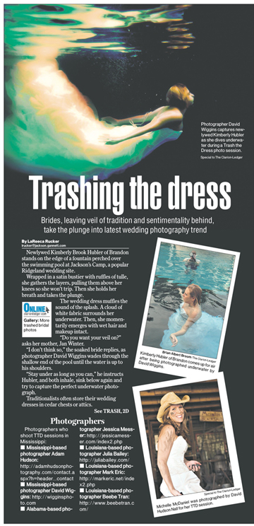
For this page, I interviewed the photographer while he conducted a "Trash the Dress" photo shoot in a swimming pool. Our photographer was also there to catch him in action. For the page design, I wanted to use the subject's underwater photographs from that day. He sent them over, and I conceptualized this design. We also used the staff photographer's photo and other art collected from another "Trash the Dress" photographer. |
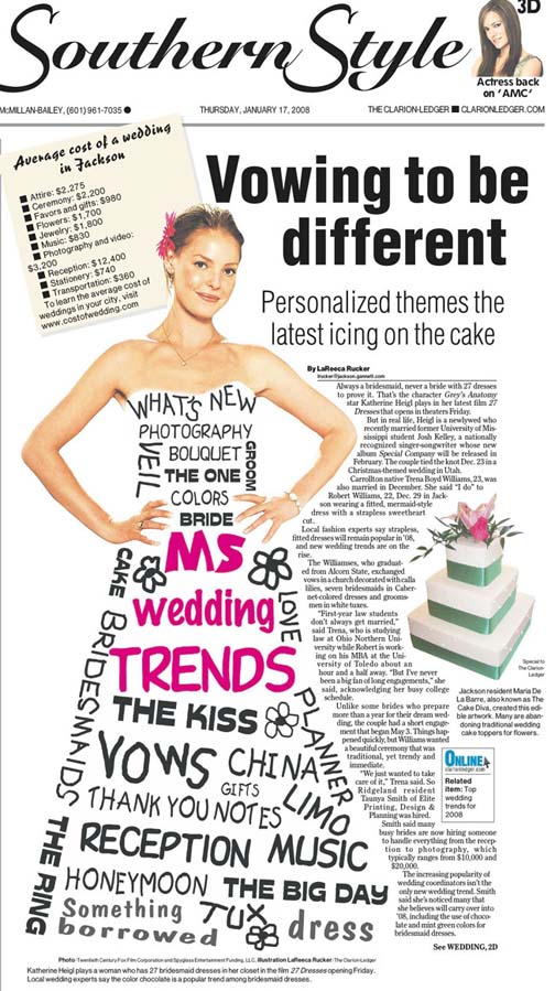 |
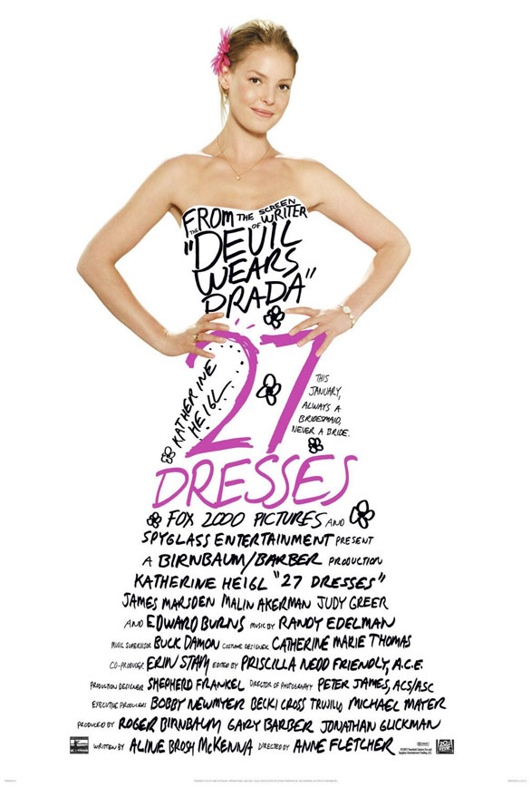
I took the movie poster for "27 Dresses," right, and changed the words that decorate the dress in Photoshop for a Mississippi wedding trend story. The story also talks about actress Katherine Heigl's wedding to an Ole Miss grad. |
 |
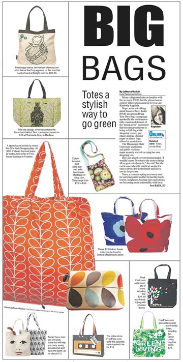
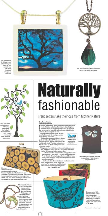
I drove around town and photographed some of the bags for this fashion story. I also collected art from companies and "cut out" the products in Photoshop, eliminating the background. Then I worked with a page designer. |
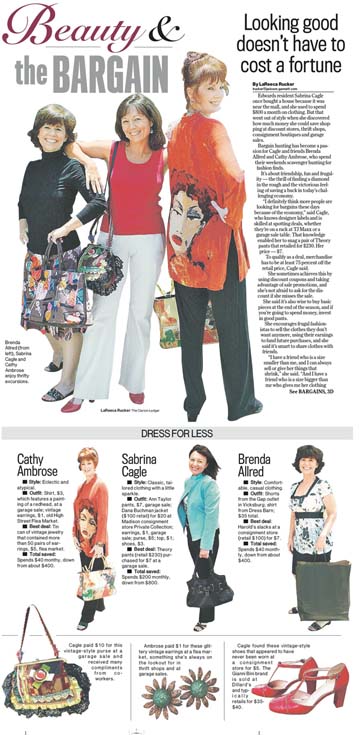
I arranged a photo shoot with three friends who are bargain shoppers. I took their photos one Saturday along with some of the items they purchased thrift shopping. Then, I "cut" them out in Photoshop, eliminating the background, and gave them to our page designers, who created this layout. |
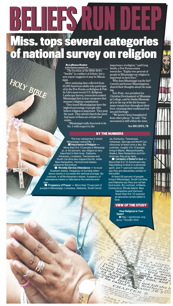 |
I gathered the file art for this story and gave it to the page designers, suggesting they use the shape of Mississippi as the background for the story text. |
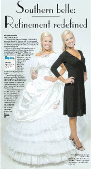 |
I tracked down this model (in a very short period of time), who miraculously had her own hoop skirt dress because she had played the role of a Southern belle during a historic pilgrimage event in Natchez. Since she worked across the street from the newspaper at the Mississippi Museum of Art, she agreed to come over and wear the dress and a contrasting modern outfit. The photographers shot her in both and paired the pictures for this layout. |
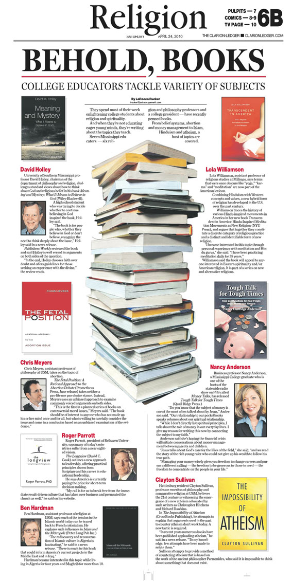
I arranged a stack of books as the dominant photo for this piece, and our photographers shot the picture. I also collected photos of all the professors mentioned in the story and their books, then handed the art over to our page designers who arranged it in this layout. |
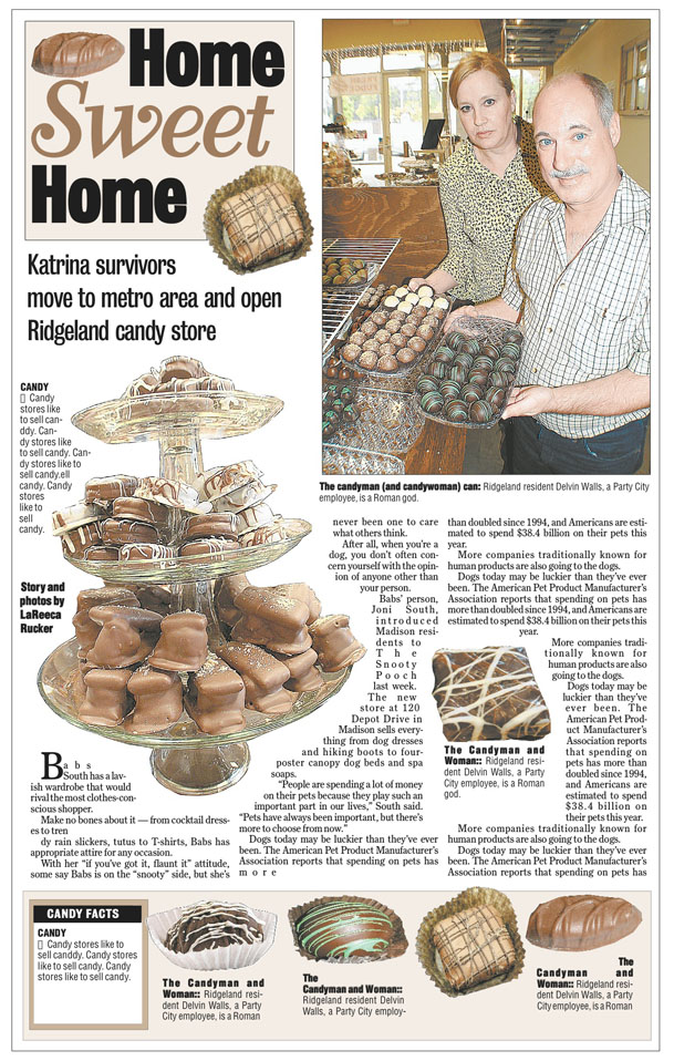
I shot the photos for this piece, cut them out in Photoshop to eliminate the background and designed this page. |
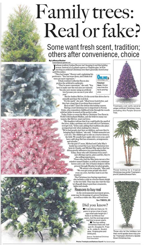
Inspired by a similar layout, I asked our photographers to shoot some trees for sale locally. The other art came from companies that sell the products. Our page designers cropped the trees and combined the photos to create this layout. |
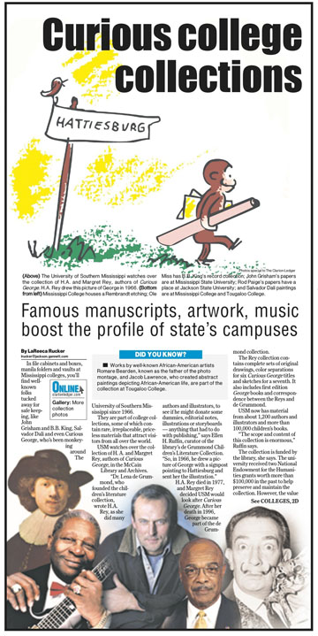
I collected pictures of each of the people in this package, and our page designers created a collage. I also collected the Curious George illustration from a local college to use as the dominant art. |
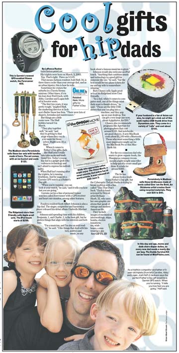
Intending to create a product page, I collected all of the art for this gift guide piece and arranged a photo shoot with the dad below for dominant art. Our page designers put it together.
|
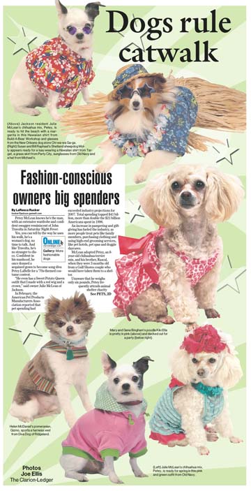
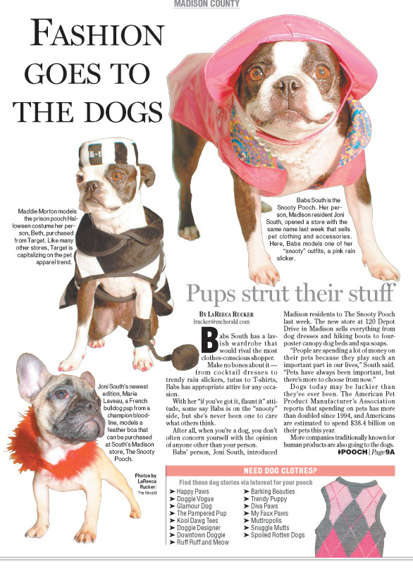
I set up the photo shoot with these dog models. Photographer Joe Ellis took their pictures, and our page designers created the layout.
|
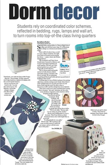
I collected the art for this package from companies, and our page designers created the layout.
|
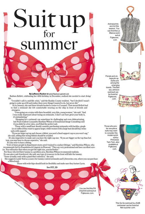
With a product page design in mind, I collected the art for this fashion piece and cut some of it out in Photoshop, eliminating the backgrounds. Our page designers created the layout.
|
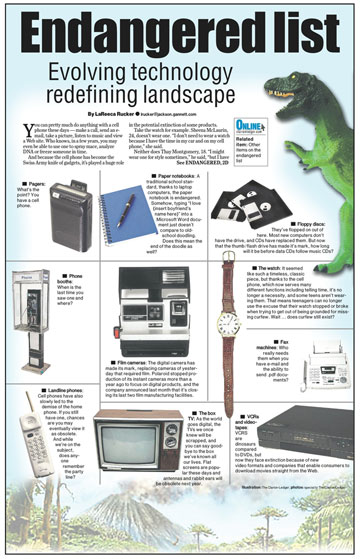
With the idea for this story and layout in mind, I collected all of the art, and our page designers put it on the page.
|
I set up a photo shoot with these dogs, photographed them in our office and gave the art to our page designers.
|
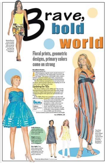
I shot the art for this fashion piece, cut out the photos eliminating the backgrounds in Photoshop and gave the art to our page designers.
|
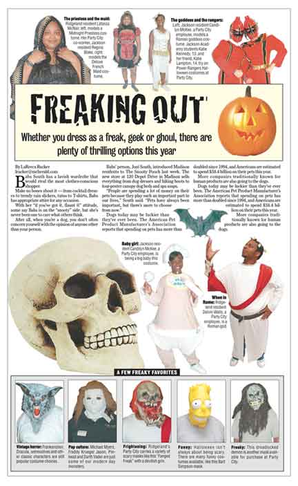
I shot the photos for this Halloween story and cut them out in Photoshop eliminating the backgrounds. I also designed the page.
|
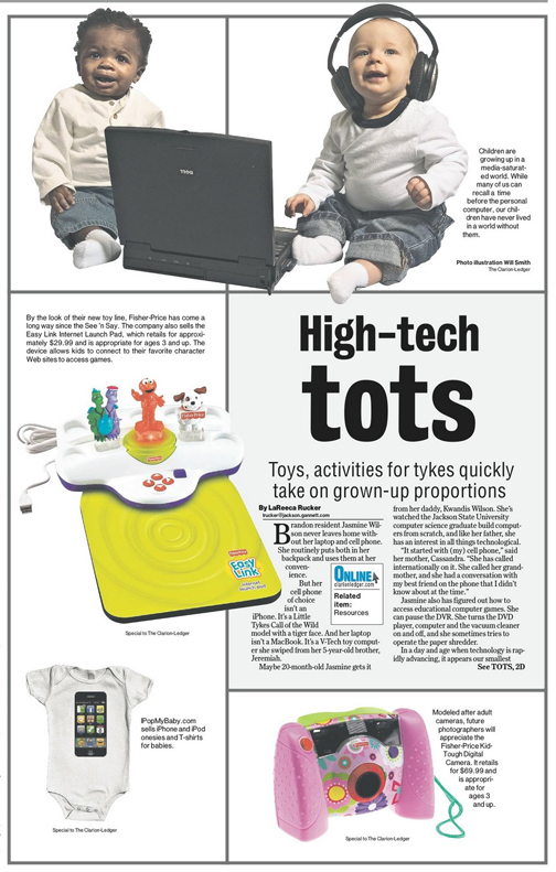
I set up a photo shoot with these babies. (That's my computer they're playing with.) Because the father of one of the children is a photographer, he shot the package. I also collected the other art and conceptualized the design. Our page designers put it together.
|
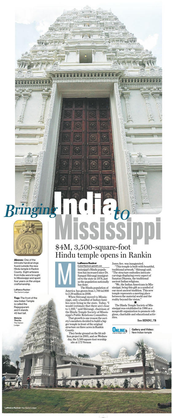
The dominant photo is one we already had on file taken by another photographer. But I spent part of my time at the temple taking pictures. Two of mine are featured in this package - the small inset at left and the photo at the bottom of the page. Our page designers created the layout.
|
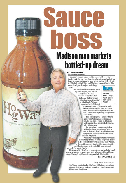
I conceptualized the idea of having the bottle of sauce large and the creator of the sauce small. Our photographers shot the bottle and man, and our page designers put the package together.
|
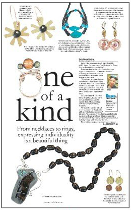
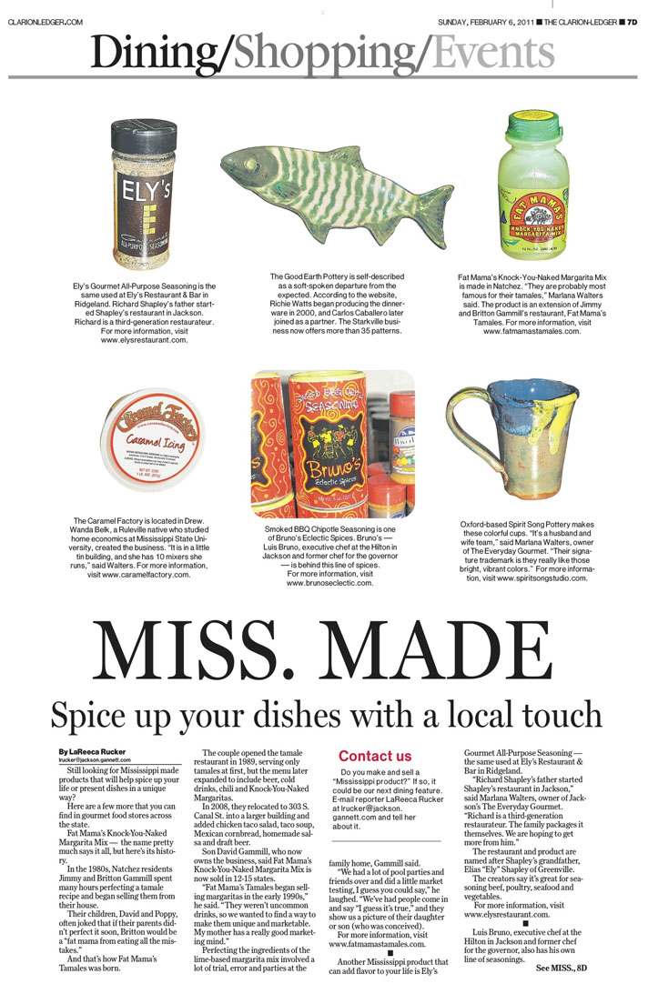
I collected pictures of these handmade items, and our page designers arranged them. But it was my idea to use the ring as the "O" because I had seen it in a similar layout.
|
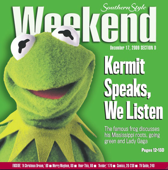
I envisioned the cover of this section for my exclusive Q & A with Kermit the Frog, collected the art, and our page designers created it.
|
I took the photos for this layout.
|
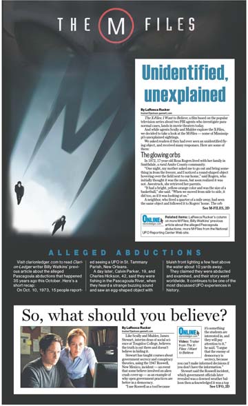
I came up with the idea of taking the film poster from "The X-Files" movie and changing the "X" to an "M" for Mississippi. I contacted the film company and got the poster, then gave it to our art director. If you look closely, you can see that he faded in an alien head behind the M-Files art.
|
I arranged the photo shoot with these models, envisioning the girls as dominant art, and I collected the other art that is used on the page. Our page designers created the layout.
|
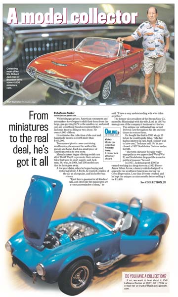
I conceptualized the idea of the model car larger than the man in this photo who is the model car collector. Our art director merged the two images to create the dominant photo.
|
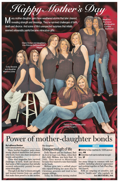
I set up the photo shoot with these women and asked them to wear matching shirts. I didn't, however, tell them to all wear maroon shirts, but oddly enough, they all showed up in the same color. Our art staff cut out the images and added the rose background.
|
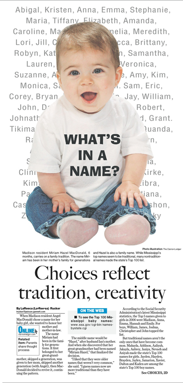
I arranged the photo shoot with this baby, and conceptualized the design for the page. I later took the image and added "What's in a Name?" in Photoshop.
|
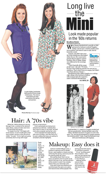
I arranged a photo shoot with these girls, envisioning them as the dominant art element. Our page designers created the layout.
|
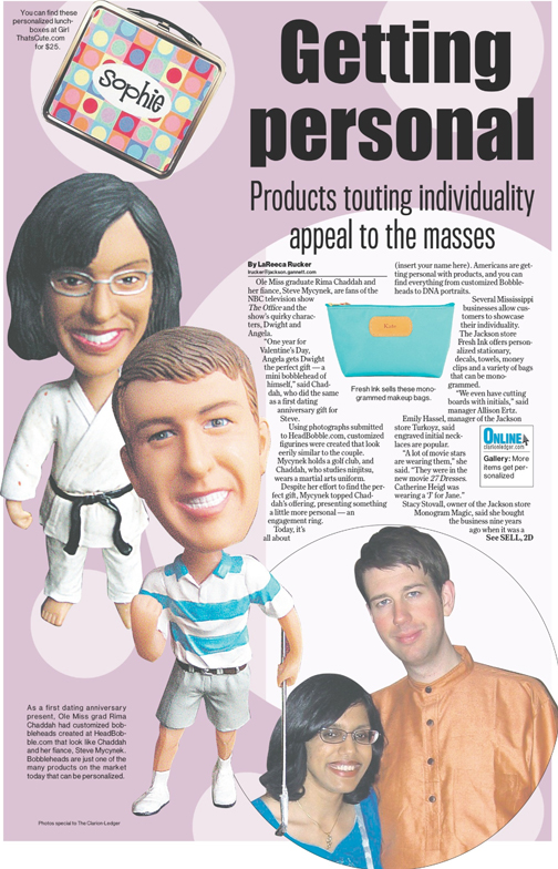
I collected all of the art for this piece with hopes of using the bobbleheads as dominant art and turned it over to our page designers.
|
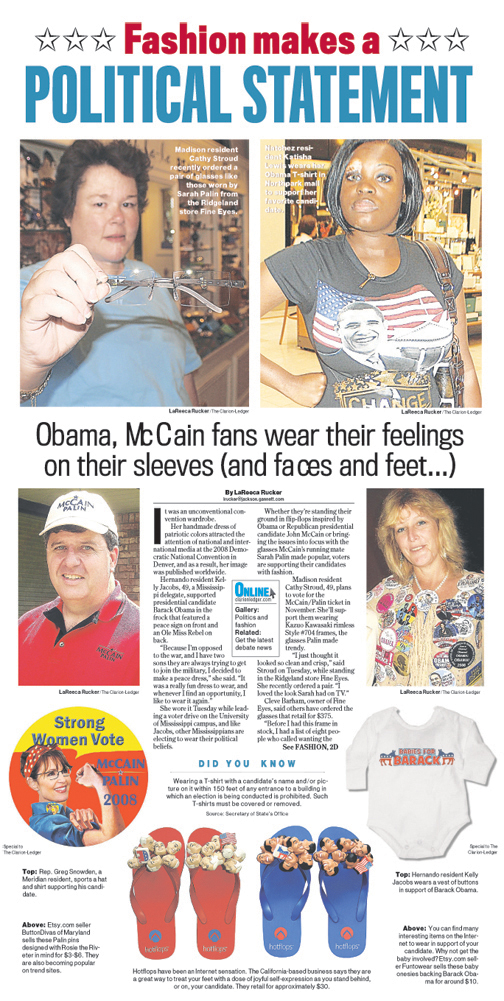
I searched high and low until I could find two Republicans and two Democrats for this story about political fashion. I tracked one lady down in a store that sold glasses and another in the mall. I also collected product art and turned it over to the page designers, suggesting that they keep it as balanced as possible.
|
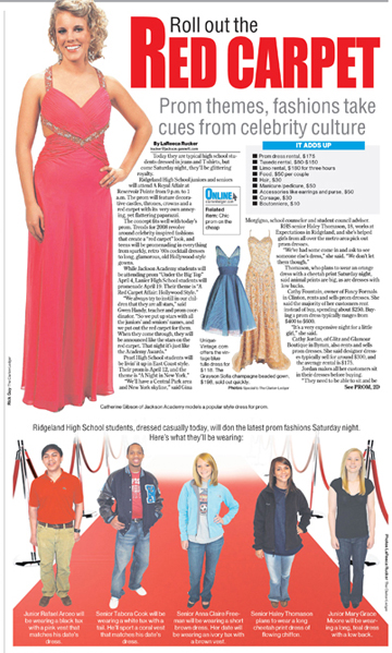
I went to a local high school and shot photos of the five students at the bottom of this page, and I arranged a photo shoot with the girl at the top for dominant art. Our photographers took her picture, and our page designers cut out the background of the photos and added the runway and red ropes. I also collected the dress art for the page.
|
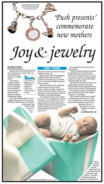
I conceptualized the idea of having a baby in a present. Photographer Will Smith photographed the baby and created the box the baby is placed within.
|
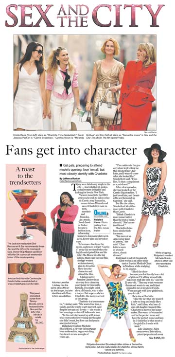
With the "Sex & the City" movie coming out, I wanted to find three women who could talk about which character they related to most. The ones I interviewed agreed to come down for a photo shoot dressed in character. I also collected the movie photo from the film company and the product art at left.
|
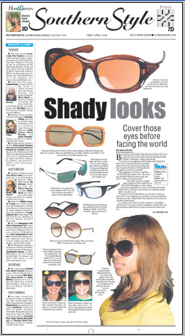
I collected all of the photos of sunglasses and shot the other photos for this page.
|
Inspired by a similar layout, I conceptulized the idea for this design and collected the product art that was used to create it.
|
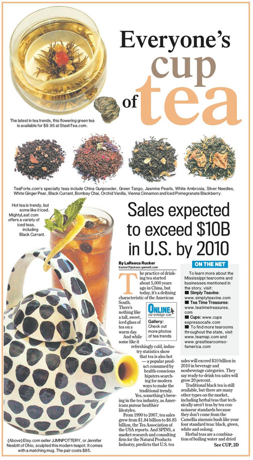
I collected all of the product art for this page and suggested that the teapot and blooming tea photos be dominant art. Our page designers came up with this.
|
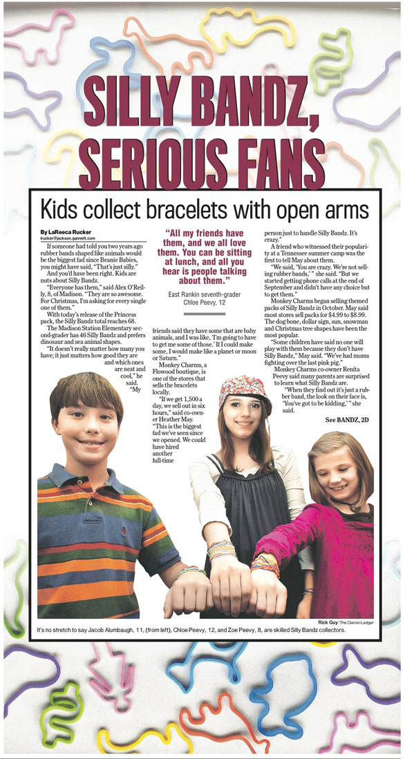
I collected the Silly Bandz art with the intention of using it as a background for the package. Our photgraphers shot the photo of the children.
|
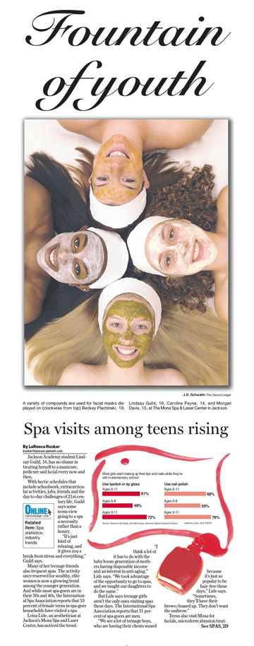
I explained what kind of photo I was hoping for to the owners of this spa and laser center, hoping for a diverse group of girls who could be arranged in this position wearing facial masks with the photographer shooting over them. The business contacted the girls and had the photo set up when the photograper arrived. The photographer snapped the photo and later won an award for it.
|
I shot the photos for this package.
|
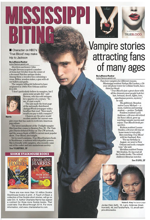
I put out an online query to find "True Blood" fans and look-alikes. The three people pictured on this page responded and came in for a photo shoot. I asked them to bring fake fangs for the shoot!
|
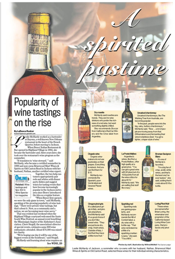
I conceptualized the idea for this story and design.
|
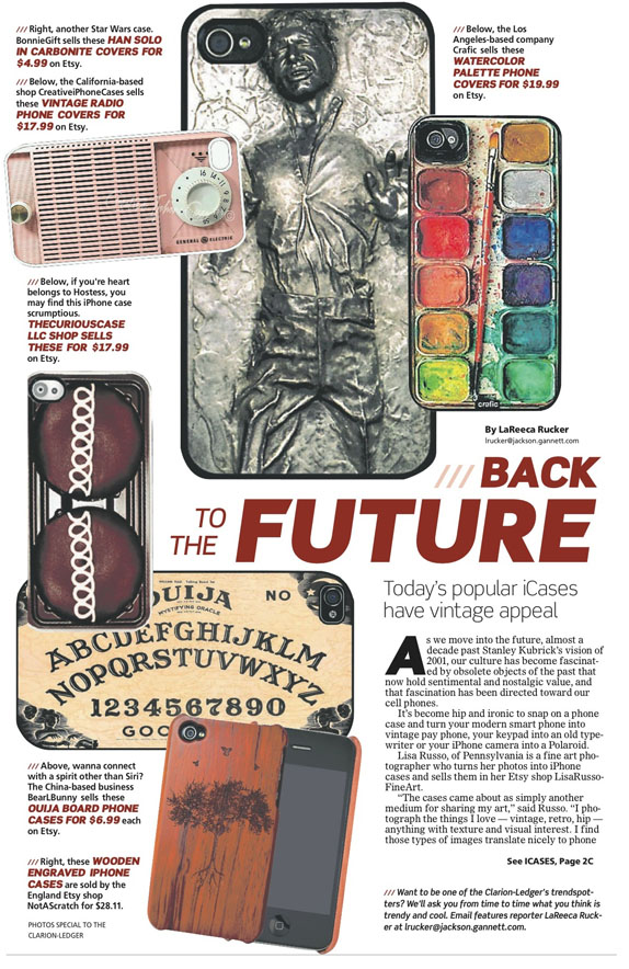
I conceptualized the idea for this story and collected all art for it. Our corporate page designers put it together. I was hoping they would use more of the vintage-inspired cases I collected - like those that looked like pay phones, old typewriters and vintage cameras, since that is what the story is about, but I thought the page turned out well anyway.
|
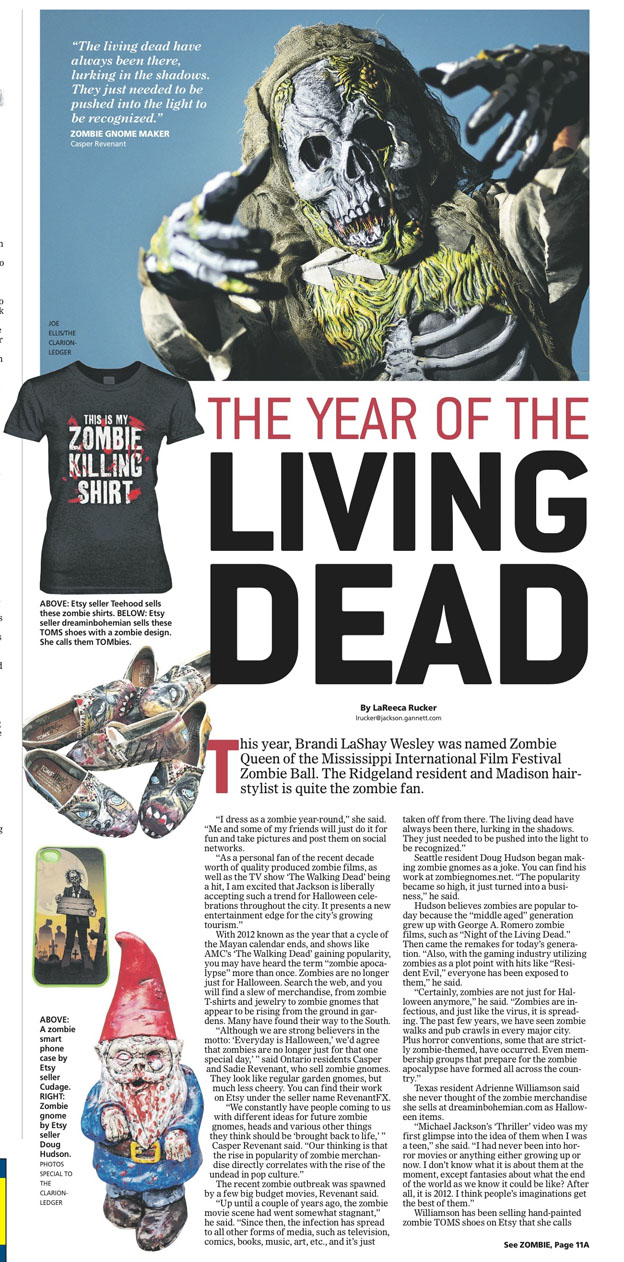
This was my headline idea. I also conceived the idea for the story and collected all the art for the package, even the zombie gnome and Tombie shoes! :) The corporate page designers put it together.
|
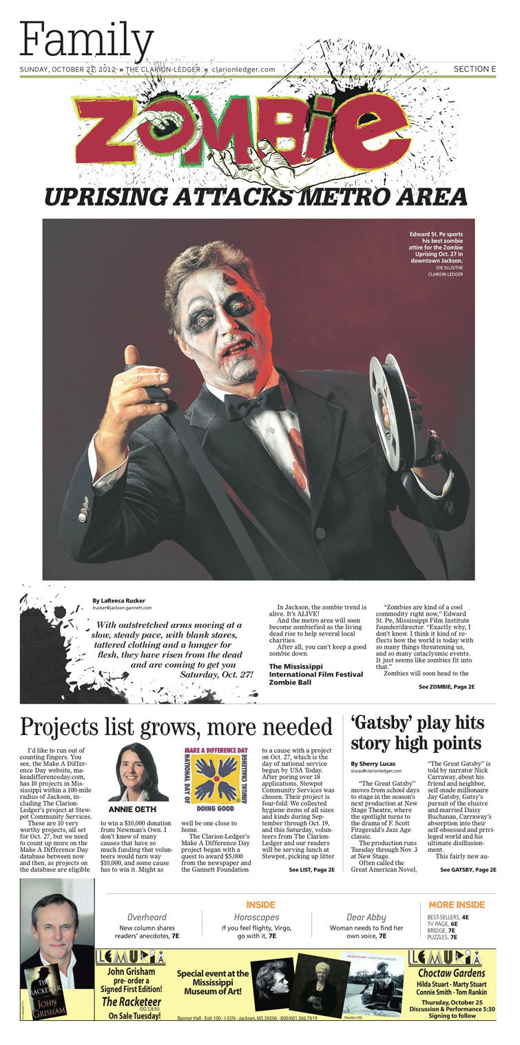
We had a number of zombie events this Halloween, so I conceptualized the idea for this story and design. Luckily, we had a willing participant who agreed to dress like a zombie, bring props and come to our office. I suggested that he be a suit- and tie-wearing zombie instead of a normal clothes-wearing zombie. He did his own makeup, and our photographers shot the photo. This was my headline, but the designers got creative with it.
|
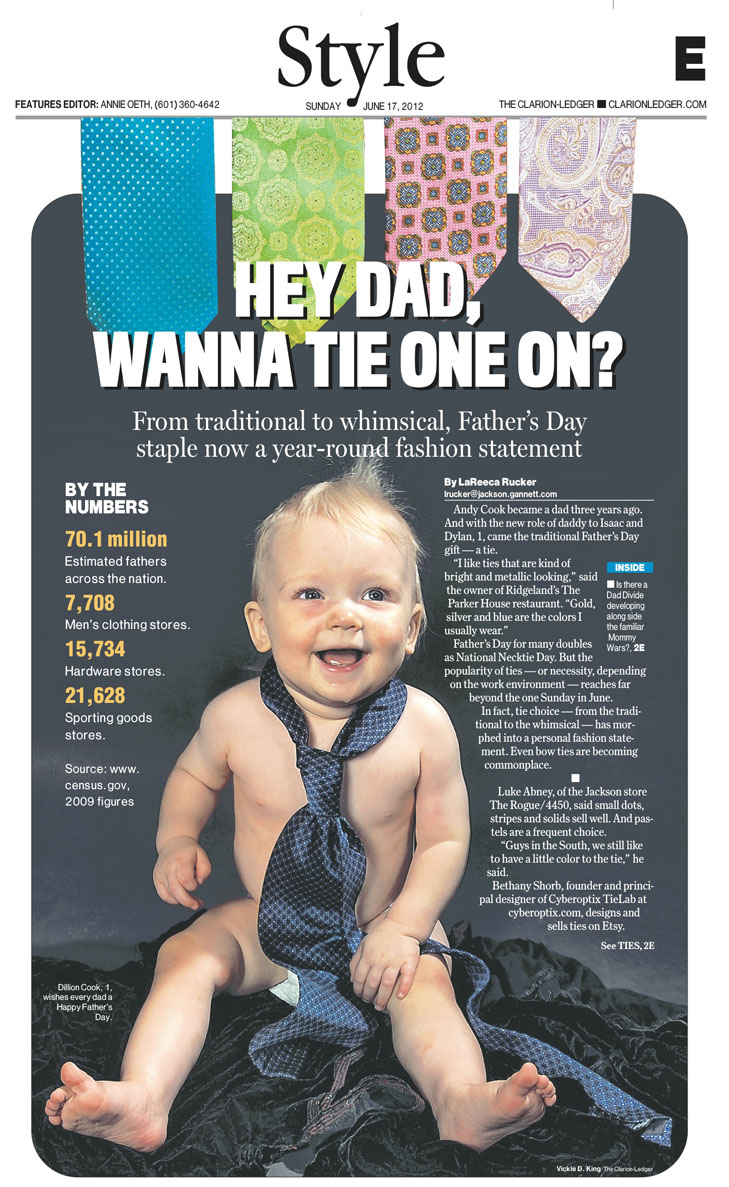
I conceptualized the idea for this story and design for a Father's Day feature. Who can resist reading a story featuring a cute baby wearing a tie, right? I convinced one of the dads interviewed to bring his son to our photography studio along with several of his favorite ties (dark colored ones so they would show up best). He obliged, and our photographers took the picture. I also collected the tie art that was used at the top. My editor came up with the headline.
|
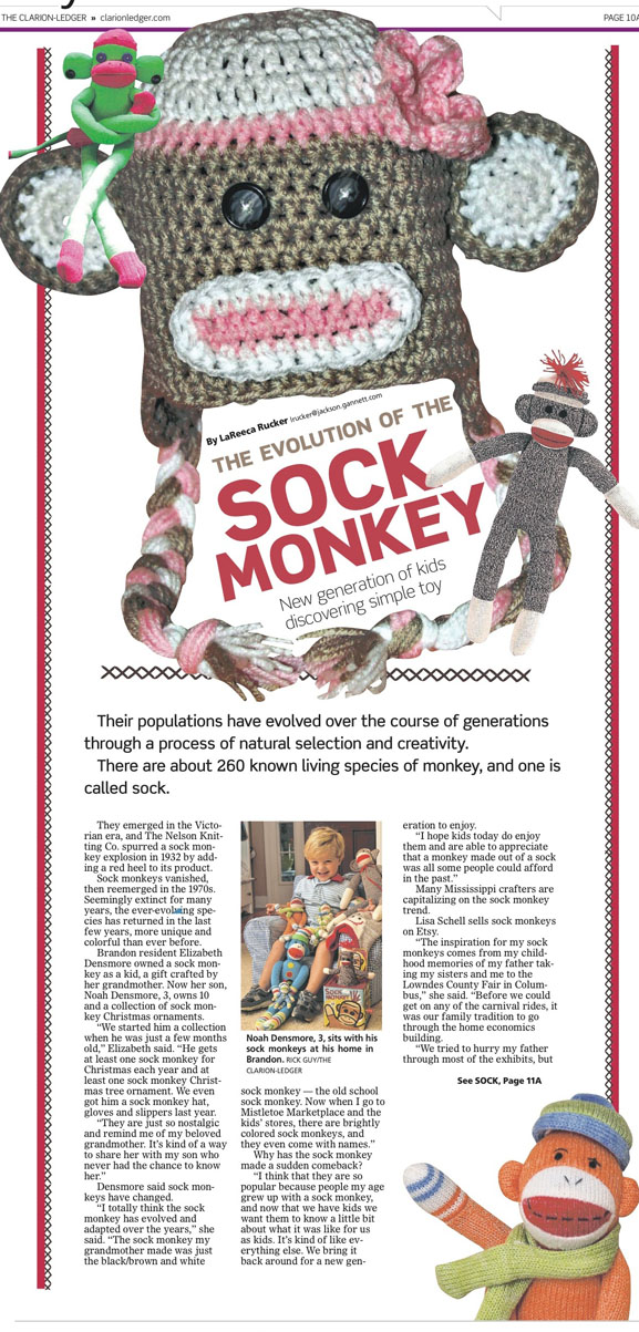
When I noticed the ongoing sock monkey trend, I orignially wanted to photograph vintage sock monkeys and modern sock monkeys, positioning them in an "evolutionary" photo, like you see in science books that depict the evolution of man. That did not fit my time schedule, but I was able to track down a little boy who has quite the sock monkey collection, and gather other sock monkey art from Etsy sellers for this piece. Our corporate designers put it together. The headline was my idea.
|
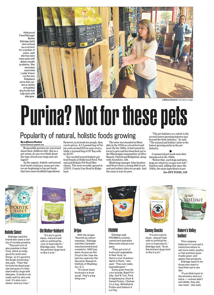
We did this story on the growing popularity of organic and healthy pet foods. I shot all the photos for the package.
|
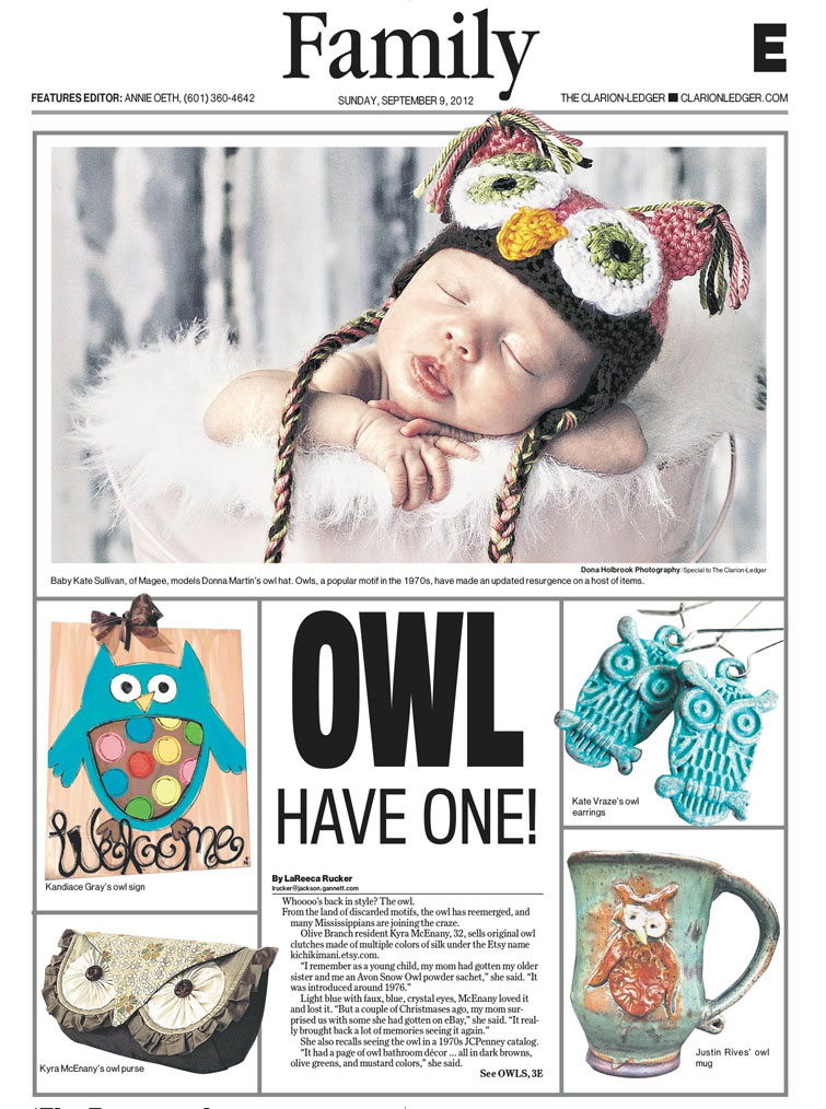
I conceptualized the idea for this story and collected all of the owl art from various individuals. Our corporate designers put the package together. |
I conceptualized the idea for this story and shot all the photos for the piece.
|
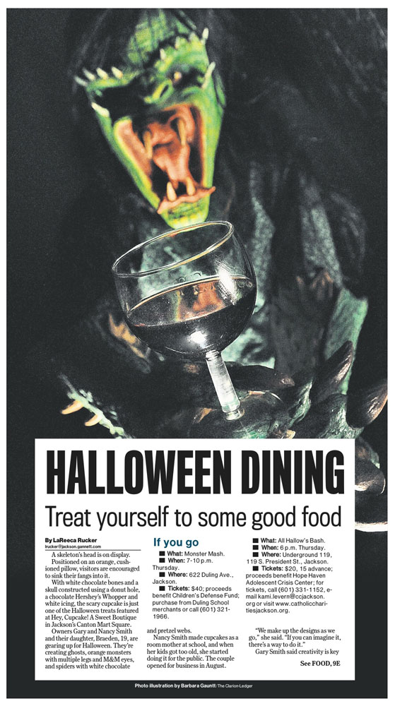
A coworker who helps create and run an annual haunted house for charity had this monster costume. She agreed to dress up. I brought a wine glass from home, and the photographers shot the picture.
|
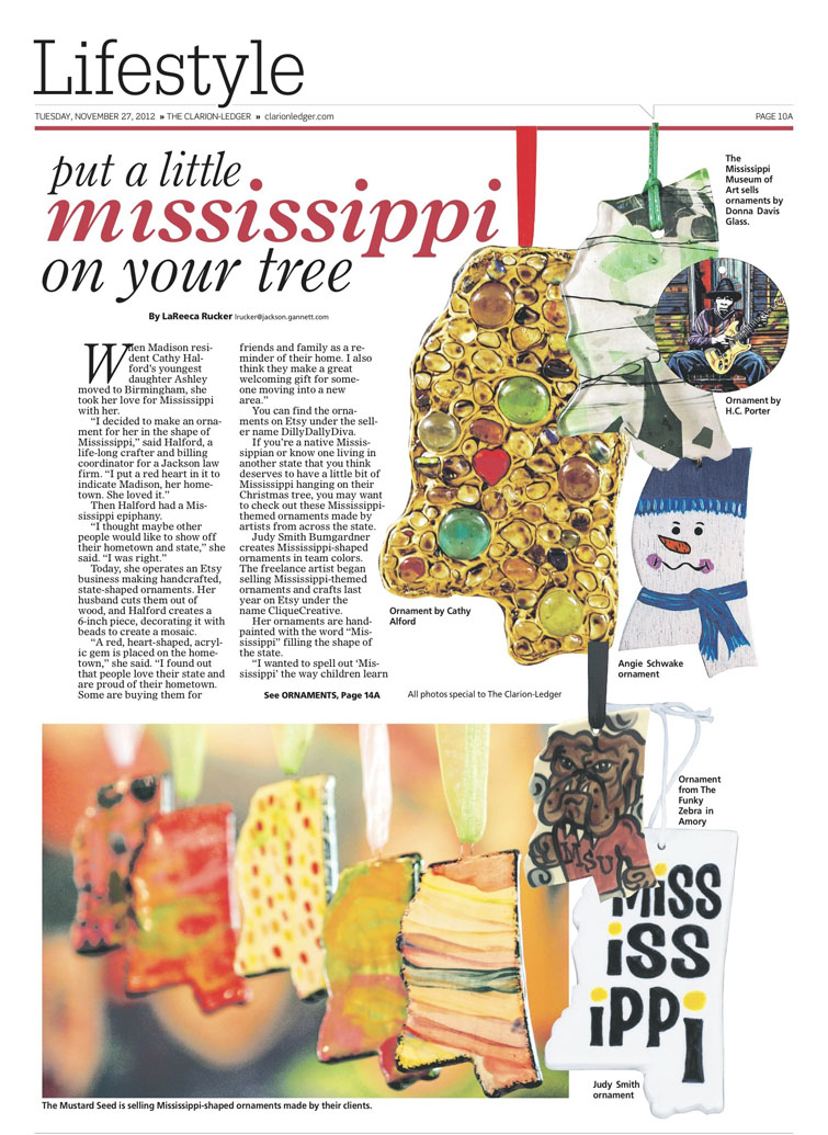
My editor came up with the idea for this Christmas story. I collected the art from various places. Some came from Etsy sellers and local business owners in town. I also shot some of the art at a craft fair.
|
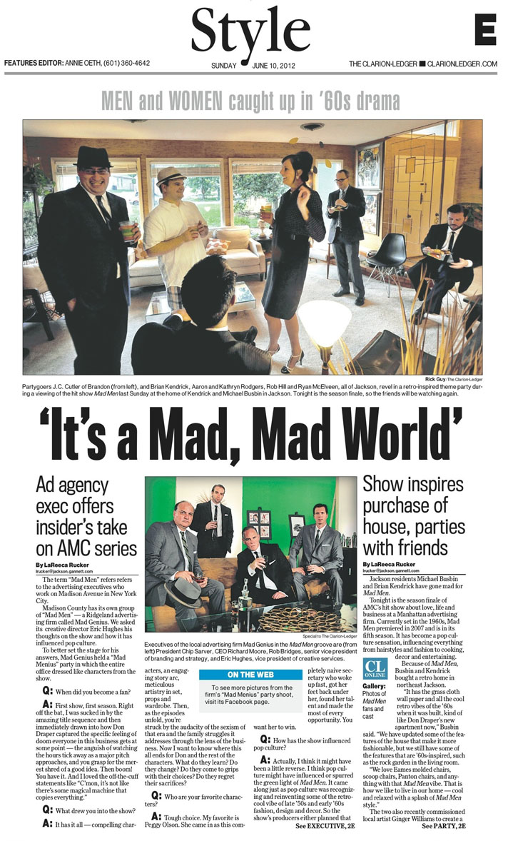
I conceptualized the idea for this story and design. When I initially heard that local residents were hosting a "Mad Men" party, I asked our photographers to shoot it. Little did I know that the owners of a local advertising agency that I also contacted to interview for this piece were going to create their own amazing photos. They sent us three photos. One was of the girls dressed "Mad Men" style. One wa of the guys, and one was of the whole group that looked exactly like a shot from the show. While some of us were rooting for the large group photo of the advertising agency, the party shot was used instead. I still thought the package turned out well.
|
